Orchestrate AI insights into action
7 Essential Reports and Dashboards Every Aviation Company Needs to Have
June 16, 2025
Is your aviation company flying blind? Discover the 7 essential dashboards that help airlines, MROs, and suppliers operate smarter, safer, and more profitably.
Why dashboards matter in aviation
In aviation, data is everything and everywhere. The skies are aflood with a constant deluge of sensor readings and pilot-screen figures in the dashboard.
But true insights are rare, unless you’re looking at the right dashboards with accurate, well-connected data points. In an industry with paper-thin margins and ironclad regulations, aerospace companies can’t afford the occasional blind spot. The right aviation dashboards can reposition teams from reactive to proactive.
Every aviation company, from cargo carriers to charter operators, faces operational complexity that spans fleets, crews, regulations, maintenance, and finances. But not all dashboards are created equal. Some waste time with vanity metrics, some show so much data that true insights are buried, and others quietly power the most efficient, compliant, and profitable fleets in the sky.
This article breaks down the seven essential dashboards that every aviation organization should have. We’ll cover what these dashboards track, why these metrics matter, and how they tie back to business results. Whether you’re running a regional carrier or a global MRO provider, these dashboards can help you unlock more value from the data you already collect.
Flight operations dashboard
Flight operations dashboards are the heart and guts of an airline’s day-to-day performance. They track real-time data around departures, arrivals, delays, aircraft utilization, and other metrics that reveal how smoothly (or not) your operation is running.
What a flight operations dashboard tracks:
- On-time performance by route or tail number
- Delay causes (weather, maintenance, staffing)
- Aircraft utilization and cycle counts
- Turnaround times and ground delays
- Passenger loads, cancellations, and rebookings
Why a flight operations dashboard matters:
Flight delays and inefficiencies drain costs fast. Ops teams able to visualize the root causes of disruptions and identity patterns can better allocate resources, adjust schedules, and prevent recurring problems. A well-structured dashboard flags issues and powers quick, optimal decisions that reduce cascading effects across the network.
Who uses a flight operations dashboard:
- Operations managers
- Flight dispatchers
- Network planning teams
- Customer service teams that monitor rebooking
Common flight operations dashboard KPIs:
- % of on-time departures and arrivals
- Average aircraft turnaround time
- Ground delay minutes per flight
- Fleet utilization rate
For example, an interactive dashboard can hone in on which hub constantly suffers from extended taxi times or baggage delays. This insight helps target fixes—whether staffing, gate management, or airside logistics.
Flight ops dashboards are especially effective when paired with automated alerts and customizable views for different users. Teams don’t just see the problem quickly; they’re well-positioned to quickly act.
Maintenance, repair, and overhaul (MRO) dashboard
The MRO dashboard helps aviation companies stay on top of aircraft health, maintenance schedules, component life cycles, and compliance records.
Managed properly, your MRO dashboard helps prevent costly downtime, supports safety, and helps to ensure that regulatory requirements are met with minimal disruption.
What an MRO dashboard tracks:
- Scheduled vs. unscheduled maintenance events
- Parts inventory and logistics timelines
- Maintenance turnaround times (TAT)
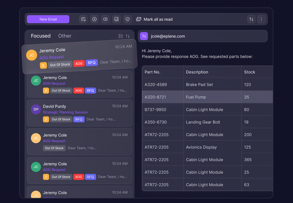
- Aircraft-on-ground (AOG) status and duration
- Service bulletin and airworthiness directive (AD) compliance
Why the MRO dashboard matters:Unplanned maintenance can ground an aircraft and cost airlines tens of thousands of dollars per day. MRO dashboards help forecast component replacements, monitor deferred maintenance risks, and prioritize tasks. They also play a crucial role in simplifying audits by keeping digital records updated in real time.
Who uses an MRO dashboard:
- Maintenance planners
- Engineers and technicians
- Compliance and quality assurance teams
- Procurement and logistics managers
Common MRO dashboard KPIs:
- Mean time between unscheduled removals (MTBUR)
- Average TAT by aircraft or part type
- AOG frequency per aircraft
- Maintenance cost per flight hour
For example, a maintenance dashboard might alert planners to a pattern of unscheduled hydraulic pump replacements on a specific aircraft model. That signal can trigger a proactive investigation or redesign effort.
Paired with integrated parts tracking and supplier data, MRO dashboards help minimize downtime while keeping costs predictable. Visualizing this data also supports data-driven conversations with OEMs and suppliers.
Safety performance dashboard
Aviation is built on a culture of safety. The safety performance dashboard tracks hazards (known and potential), incident trends, safety reports, and proactive risk indicators to help ensure your operation meets internal standards and regulatory expectations alike.
What a safety performance dashboard tracks:
- Reported safety incidents and near misses
- Risk classification and severity trends
- Findings from safety audits or inspections
- Voluntary safety reports, such as the Aviation Safety Action Program (ASAP) and Safety Management System (SMS)
- Safety action plan completion rates
Why a safety performance dashboard matters:A reactive safety approach is no longer acceptable. Dashboards help teams identify trends before they result in accidents, such as surges in bird strikes, increased fuel leaks, or repeat maintenance issues tied to human error.
Who uses a safety performance dashboard:
- Safety managers
- Compliance and quality assurance teams
- Executives reporting to regulators
- Flight ops and maintenance leadership
Common safety dashboard KPIs:
- Safety reporting rate per 1,000 flight hours
- Average time to close a safety investigation
- Repeat event frequency
- Top 5 hazard categories over time
An effective dashboard supports SMS systems by aligning safety data across departments and highlighting where corrective actions are overdue. Visualizing trends helps prioritize resources and infuse safety throughout all organizational practices.
For example, an organization may notice a rise in tailstrike incidents during certain approaches. Dashboards that overlay weather, crew, and operational data can uncover root causes and drive targeted mitigation (Safe.org: Future Sky Safety).
Operational performance dashboard
The operational performance dashboard gives a real-time pulse on flight operations, ground services, and overall schedule adherence. It helps ensure that delays, cancellations, and inefficiencies are tracked and minimized, improving both profitability and passenger experience.
What an operational performance dashboard tracks:
- On-time departure and arrival rates
- Turnaround time by airport/station
- Delay causes and recurrence
- Flight completion rates
- Ground crew and gate performance
Why an operational performance dashboard matters:Flight delays and irregular operations harm customer satisfaction and create cascading costs across the network. Dashboards help pinpoint bottlenecks at specific airports, identify repeat mechanical delays, and measure gate or ramp productivity.
Who uses operational performance dashboards:
- Operations control centers (OCC)
- Ground operations managers
- Network planning teams
- Airline executives
Common operational dashboard KPIs:
- On-time performance (OTP) % by route or aircraft type
- Delay minutes per flight hour
- Average turnaround time by station
- Completion factor (percentage of scheduled flights completed)
With dashboards, operations managers can monitor performance by hub, detect inefficiencies by carrier or crew, and adjust in near real time. Visual tools help communicate patterns that would be buried in spreadsheets, enabling faster decisions.
For instance, a spike in taxi-out delays at a major hub might signal under-resourced ground operations. Dashboards make it easy to flag and investigate such patterns before they become chronic (money-sink) issues.
Financial performance dashboard
Financial dashboards connect operations to outcomes, tracking costs, revenue, and profit margins throughout different business areas. They can empower aviation leaders, neither data engineers nor accountants, to make more accurate forecasts, spot inefficiencies, and align budgets with strategic goals.
What financial performance dashboards track:
- Revenue per available seat kilometer (RASK)
- Cost per available seat kilometer (CASK)
- Fuel cost trends and hedging performance
- Route profitability
- Maintenance and crew costs
Why a financial performance dashboard matters:Aviation is a low-margin business where every (in)efficiency counts. Dashboards help CFOs and planners understand where profit is leaking, whether it’s through inefficient crew scheduling, excessive maintenance costs, or underperforming routes.
Who uses financial performance dashboards:
- Finance and FP&A teams
- Route planning and network strategy leaders
- Airline executives and shareholders
Common financial performance KPIs:
- EBITDA (Earnings Before Interest, Taxes, Depreciation, and Amortization) margin per quarter
- Break-even load factor
- Route-level profit vs. loss
- Budget vs. actual performance by department
These dashboards pull from multiple systems, booking platforms, ERP tools, fuel hedging databases, and flight ops software, to give a full view of company financial health. With a clear, accurate visualization of profit drivers and cost sinks, leadership can shift from reactive budget cuts to strategic investments (McKinsey & Company).
For example, a route that looks extremely profitable at the surface might have hidden costs from crew layovers or increased maintenance events. Financial dashboards connect these dots and surface the true margins.
Compliance and audit readiness dashboard
With stringent domestic regulatory oversight and equally tough international standards, aviation organizations must stay audit-ready at all times. The compliance and audit readiness dashboard tracks all required documentation, certifications, and regulatory deadlines across teams and geographies, reducing the scramble when an audit event occurs.
What a compliance and audit readiness dashboard tracks:
- Certification status for aircraft, crew, and facilities
- Regulatory deadlines and renewal dates
- Internal audit findings and resolution rates
- Training and licensing records
- Document revision and approval status
Why a compliance and audit readiness dashboard matters:
A surprise audit or a missed recertification can disrupt operations, trigger fines, and even ground aircraft. This dashboard centralizes compliance activity so nothing falls through the cracks. It supports alignment with FAA, EASA, ICAO, and other regulatory bodies across jurisdictions.
Who uses compliance and audit readiness dashboards:
- Compliance and QA teams
- Safety and training departments
- Legal and regulatory affairs
- Operational executives
Common compliance and audit readiness KPIs:
- % of crew with current certifications
- % of overdue audit findings
- Compliance task completion rate
- Time since last successful audit
A well-designed dashboard can catch issues early. As one example, it could show a decline in pilot license renewals within a 60-day window, prompting HR to intervene with targeted outreach or automated reminders.
Paired with document control systems, these dashboards help organizations digitize compliance records and streamline audit responses, shaving days off the audit process while minimizing audit prep time—and worker stress.
Beyond the top 7 essential reports: Other helpful dashboards
While we’ve shared the top 7 dashboards essential for all aviation companies, there is some variance. Not every aerospace company will use the exact same seven.
The seven dashboards we’ve showcased broadly represent the most impactful ones across flight, MRO, and OEM operations, but in truth, dashboard needs vary by company. Needs will differ based on the organization’s size, specialty, regulatory environment, and business model.
A freight carrier might prioritize cargo load optimization, route profitability, and customs clearance delays, while a private charter company needs dashboards for client satisfaction, fleet availability, and maintenance tracking at a more granular tail-number level.
And defense contracting is a totally different beast. These companies require additional oversight dashboards tied to government reporting standards, cybersecurity compliance, or long-lead part procurement timelines.
Also, having seven dashboards may not cut it.
For some operators, five dashboards may cover 95% of what they need to monitor. For others, particularly multi-division carriers or large MROs, they may need no fewer than ten truly critical dashboards. What matters is not how many dashboards you have, but whether they’re telling you the right story.
Other commonly used aviation dashboards
Crew performance and scheduling
Crew dashboards surface deeper operational insights across flight duty periods (FDP), fatigue risk, and training progression. Regional carriers and long-haul airlines alike rely on these dashboards to prevent costly misalignments in staffing and ensure regulatory compliance.
For charter operators, where pilot availability and customer matching must be precise, these dashboards enable effortless personalization and help maintain VIP satisfaction. Some systems also integrate crew licensing and training records for proactive compliance flagging (Safe.org: Future Sky Safety).
Environmental and fuel efficiency metrics
Dashboards that track fuel burn, contrail impact, and CO₂ emissions per route are becoming essential as sustainability gains traction. They’re especially critical for European operators navigating expanding ETS (Emissions Trading Scheme) rules (European Union Climate Action).
Increasingly, companies are using their safety and compliance dashboards to monitor environmental performance too, tracking additional factors like fuel burn anomalies and fuel inefficiencies caused by operational procedures (Safe.org: Future Sky Safety).
Freight carriers can also use dashboards to visualize emissions per kilogram of payload, enabling better route planning and fleet optimization.
Beyond ESG and green initiatives, fuel-efficiency metrics, in addition to safety and compliance, can also be used as part of operational dashboards.
Customer experience and service quality
Dashboards focused on passenger experience, tracking complaint resolution, connection success rates, and even inflight entertainment engagement, are vital for loyalty, remarketing, and service recovery.
Atlassian, strong in dashboard-building and CRM integration, has a long-held belief in easily configuring different views with the same data, enabling different teams (customer experience, operations, marketing) to monitor the same data through distinct lenses (Atlassian).
Private aviation providers can also use dashboards to log and visualize trends in client satisfaction over time. This can be particularly helpful for recognizing patterns that impact retention, such as ground transfer delays or inflight amenities shortfalls.
Inventory and parts procurement
Standalone dashboards for inventory and procurement help teams manage complex supply chains, especially in environments with long lead times and heavy regulatory oversight. These dashboards track part usage, backorders, shelf life, and vendor reliability.
Additionally, inventory systems connected to maintenance records allow for smarter procurement, avoiding both stockouts and excess.
Overall, a dedicated dashboard for inventory and parts procurement can also monitor parts traceability, stock levels, and logistics performance to support aerospace operations in civil and defense settings.
IT systems performance and cybersecurity dashboard
In our digital-first aviation environment, system outages and cyber threats can ground flights just as easily as mechanical failures. An IT and cybersecurity dashboard tracks system uptime, threat activity, and application performance, keeping operations running smoothly and securely.
This dashboard is vital for organizations relying heavily on cloud platforms. Many cloud initiatives fail due to poor tracking and a lack of visibility. However, McKinsey & Company research indicates central dashboards are key to unlocking the full ROI and risk management that cloud-based platforms can deliver (McKinsey & Company).
Key metrics for IT systems cybersecurity dashboards include:
- Threat detection and response time
- Application uptime and latency
- Patching and system upgrade status
- Login anomalies and access audits
A real-world example comes from PricewaterhouseCoopers (PwC), where HR and payroll systems were visualized in a unified dashboard, enabling faster, compliance-driven decisions across departments (PwC).
For aviation firms juggling multiple digital platforms, these dashboards help prevent costly system failures, ensure data security, and simplify compliance reporting, keeping both regulators and passengers confident in your operations.
Frequently asked questions about aviation reports and dashboards
Does the FAA mandate specific KPIs to be tracked and audited?
No, the FAA does not prescribe a universal set of Key Performance Indicators (KPIs) for all aviation entities.
However, the FAA does require organizations to develop and monitor KPIs that are pertinent to their specific operations, especially within the framework of a Safety Management System (SMS).
Under 14 CFR Part 5, operators are obligated to establish safety performance indicators and targets that align with their unique operational contexts. These KPIs should effectively monitor safety performance and support the continuous improvement of safety practices.
What’s the difference between a report and a dashboard in aviation?A report is typically static and backward-looking, offering a snapshot of past performance, like a PDF showing monthly fuel costs.
A dashboard, on the other hand, is dynamic, visual, and interactive. It gives teams real-time or near-real-time data for faster decisions. Dashboards significantly outperform traditional reporting when used to track ongoing initiatives like cloud migration or operational KPIs, especially when paired with strong governance and frequent stakeholder reviews (McKinsey & Company).
How often should aviation dashboards be reviewed or updated?It depends on the dashboard’s focus. For example, a flight ops dashboard may need hourly refreshes, while compliance dashboards might only need weekly or monthly updates.
McKinsey suggests tailoring review cadences to the function, such as weekly for operational teams or monthly for CFOs or audit committees. Automating data pulls from systems like ERP, HR, or CMDB tools ensures updates are seamless and consistent (McKinsey & Company).
What makes a safety dashboard effective beyond just compliance?A truly effective safety dashboard isn’t just a checklist; but rather, it should be used as a living tool that highlights risk trends, predicts future issues, and drives a safety-first culture.
Future Sky Safety’s white paper explains how dashboards can integrate voluntary reports, audit data, and hazard trends across departments to become early warning systems, instead of just post-incident logs (Future Sky Safety).
Are there standard KPIs every aviation dashboard should include?No, every organization is unique. There are, however, common KPI families by function. SAFEORG recommends aligning KPIs to your operational model.
For instance, MRO dashboards may focus on TAT (Turnaround Time) and AOG (Aircraft On Ground) metrics, while safety dashboards prioritize reporting rates and closure times. The key is not standardization for its own sake, but consistent, cross-departmental use of actionable KPIs that align with strategic goals (SAFEORG).
Turning aviation dashboards into decision engines
Aviation dashboards aren’t just tools for BI and data engineering teams. Together, they form a powerful decision engine to connect people, processes, and performance in real time. From safety and maintenance to operations and finance, the different aviation dashboards outlined in the article work to transform complexity into clarity.
Companies that rely on outdated reports or fragmented data are flying blind. But those that invest in dynamic, well-integrated dashboards gain the visibility they need to act faster, improve margins, and remain compliant amid evolving regulatory rules and shifting market dynamics.
Dashboards are a powerful tool for airlines, regional carriers, charter companies, suppliers, and MRO providers. Organizations of all sizes and serving all sectors can benefit from tools that expose trends and remove guesswork. The key is choosing dashboards that shed real actionable insight, not just vanity metrics.
Start by asking:
- Which business units are flying blind?
- Where are decisions delayed due to a lack of data?
- What metrics really drive our performance and safety?
Answering these questions, with clarity, can make all the difference as the aviation industry grows in complexity, with even more myriad data points to connect and decipher.
Ready to upgrade from static reports to decision-ready dashboards? ePlaneAI helps aviation companies turn raw operational data into dynamic, real-time dashboards built for action. Schedule a free, personalized demo today to see how ePlaneAI can help you unlock, and win, with hidden data insights.
Aviation Maintenance Trends That May Gain Momentum in Uncertain Circumstances
Aircraft are staying in service longer, supply chains are a powder keg, and the tech is evolving overnight. Discover the maintenance trends gaining momentum and what they mean for operators trying to stay airborne and profitable.

April 14, 2026
ePlane AI's Unlock $500M in Quoting Opportunity with Automation! | Free Webinar
See how sales operators are automating RFQ extraction, eliminating manual data entry errors, and scaling their quoting operations with precision and consistency to unlock revenue.
April 10, 2026
Mission Control: High‑Performance Intelligence Infrastructure for Mission‑Critical Decision Velocity
Every leader I speak with across aerospace, manufacturing, or construction says the same thing:
Our systems are getting smarter, but our decisions aren’t getting faster or safer at the pace operations demand.
In high‑integrity environments, the gap between data and decisions is where risk accumulates. As operations grow more complex, distributed, and time‑sensitive, organizations need intelligence systems that are not just fast but verifiable, deterministic, and secure by design.
This is the engineering philosophy behind Mission Control, our high‑performance intelligence infrastructure built for real‑time, audit‑ready, cryptographically secure decision velocity.

February 2, 2026
ePlane AI at MRO Americas 2026 | The Future of Maintenance, Supply Chain, and Operational Intelligence
MRO Americas is where the aviation maintenance ecosystem aligns on what’s next — and in 2026, the conversation is shifting decisively toward operational intelligence, automation, and data‑driven decisioning. This year, ePlane AI is joining the industry in Orlando to demonstrate how deterministic, agentic intelligence is reshaping maintenance, supply chain, and technical operations.